I was recently tasked with a reverse engineering project that ended up being a real drag to carry out. The work literally felt like a puzzle, which I normally love, so why not this one?
This post is about tips for designing better tools & controls interfaces, but in the process of writing it I came up with an even more interesting idea at the root of the problem, so I’ll start there!
Every challenge in life can be viewed as a puzzle, and by classifying the qualities that make puzzles challenging we can improve our approach to designing better tools & solving them!
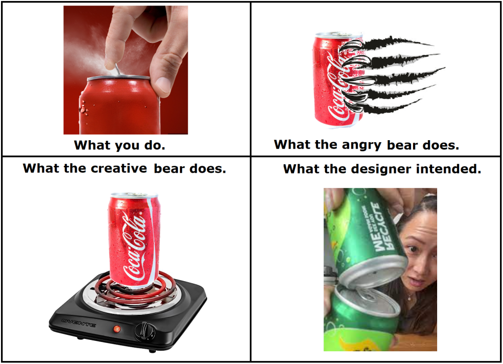
This is best illustrated with an anecdote, you’ve likely heard it:
Making tourist-friendly bearproof trash cans is a 50 year old problem, resolved 49 years ago. But the story is still regularly reposted on social media because people love anecdotes that make them feel smart. “Ha ha stupid tourists!”
What those laughing & sharing may not appreciate is that we’ve all been there before.
Figuring out the shower controls on a cruise ship. Setting the time on a niche appliance. Operating a friend’s music system. Adjusting a bowling score using that crazy control panel. In all cases the product designer wanted you to succeed but anything can be an unintentional puzzle through the eyes of someone experiencing it for the first time!
As a father of 2 and software designer I engage with people experiencing new-to-them puzzles almost every day.
First they engage in good faith…for about 60 seconds.
Then the excuses find a voice. ‘Its not difficult, it’s just tedious’…’Its not heavy it’s just awkward’…’Its not my fault, it’s just designed/explained poorly.’
Then their inner bear comes out…
‘The button didn’t work, I’ll press it faster & harder! It still didn’t work, I’ll press every button available! Maybe its something else, this piece looks funny…better get my hammer!’ Eventually the monopoly board gets flipped.
A determined bear lets their impulses take control and will use brute force wherever possible. While anger is an obvious reaction even a raging bear isn’t brainless; a creative bear can be even more dangerous. Don’t underestimate the ingenuity of fools!
So how can we help the tourists users of our creations succeed in that first 60 seconds & prevent the bear from showing up? Lets put ourselves in their shoes & try to nail down what specific aspects of the puzzle can get them stuck.
The 4 Universal Qualities of Puzzles:
I did a bit of research and found an online puzzle museum that lists a total of 14 main classes of toy puzzles. Neat stuff but ultimately unhelpful. So rather than find a concrete classification system, it’s more useful to classify the key factors at play in all types of puzzles.
As best I can tell, every puzzle has these 4 qualities of difficulty to different degrees:
1. Technique: The degree that the puzzle requires a specific approach to solving it.
Within this category there are two sub-types: Deterministic (only one way to solve it) & Non-Deterministic (multiple solutions or possible ways it can be solved.)
Deterministic puzzles are generally easier because the procedure can be specific. Steps described succinctly yet completely makes the task easier.
*As a problem solver ask: What proven procedures for solving this & similar problems can I refer to?
*As a designer ask: Is solving the puzzle simply a matter of knowing & following a procedure, or is there more? If the user follows my directions the way a computer would (literally & without making inferences) will they still succeed? If you wrote the procedure out on sequential post it notes does it look like a line or like a tree?
Even the work of dividing a procedure into logical steps can be difficult. Making too many assumptions on behalf of the user & skipping steps leads to confusion. This happens often since is significant variance in the way different people would explain how to carry out a simple process. (This idea is perfectly described in the brief Ted Talk “Got a wicked Problem? First tell me how to make toast.” )
2. Implementation: The degree that carrying out the procedure requires skill.
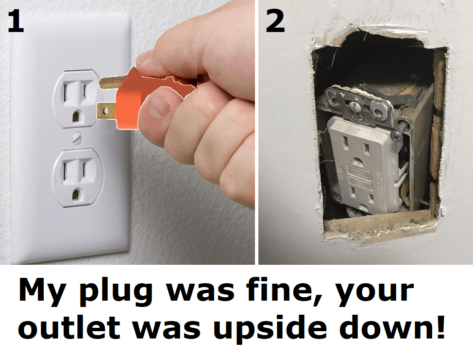
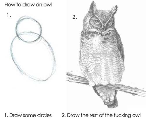
Knowing the correct technique may not be enough to solve a puzzle if applying that knowledge is inherently difficult or physically hard to achieve. Good examples are surgery, target shooting, or this blasted thing (pictured below), where the intent and procedure are readily understandable but the process of carrying it out requires delicate input only the user can provide.
*As a problem solver ask: Do I have all the resources I need to resolve this?
*As a designer ask: How difficult is to carry out the procedure? Does it require dexterity, special tools, lateral thinking, consideration of outside conditions, luck, a time limit, or a careful aim? For non-deterministic puzzles, is there a penalty for inefficient resolutions?
In all cases the best a designer can do here is attempt to fully inform, prepare, & equip the user for the task.
3. Affordances: The degree that the puzzle has features that can be acted upon.
Every puzzle has at least one affordance. These are whatever the solver has to manipulate to transition a puzzle from the unfinished to finished state. For a crossword each blank square that can hold a letter is an affordance. For a Rubik’s cube it’s each of the 6 spinning axes. For a taxi driver it’s each possible turn they have the option of taking.
In general is fewer affordances is easier, but no fewer than necessary. Excessive affordances alone is enough to create a form of puzzle out of anything. A word-search conceals words in plain sight by surrounding them with noise.
*As a problem solver ask: What are all my options for taking action?
*As a designer ask: How many possible interactions are in this system? Simply put, how many ‘unique buttons’ are there?
My fun example is the annoying gift box, a box screwed shut with 20 fine tooth screws. The procedure is obvious & easy to carry out, but the meat of the work is manipulating each affordance until the box is open. More affordances also means more opportunities for failure.
4. Signifiers: The degree that there are indications that affordances exist.
Weather consciously or not we all rely on signifiers every day. A plate on a door signifying ‘push-me’ vs a handle signaling ‘pull’. A sticker that literally says ‘open here’, or a picture of a stickman doing the task.
Things get weird when these signs don’t exist, doubly so when they actively mislead us. Hidden, ambiguous, or excessive signifiers create confusion.
*As a problem solver ask: What specific signals do I trust to help identify the correct action? What signals have lead me astray?
*As a designer ask: How obvious is it what the effect will be of any given manipulation? How aware have I made the user of the existence & function of the possible system interactions? How difficult is it to identify the correct manipulation? Is there too much/little labelling?
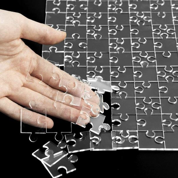
An excellent example is this clear jigsaw puzzle. There’s literally no indications to guide you!
Using these four qualities you can define exactly what type of challenge the puzzle presents to better evaluate how to proceed. When you’re helping someone out, say a kid stuck on a math problem, identifying their exact problem also presents a logical path forward:
*Kid does not know the steps to perform the mathematical procedure. = Unaware of technique, review the steps.
*Kid knows they need to add 11+23 but cannot do the mental math. = Difficult implementation, hello calculator.
*Kid gets confused by their own sloppy sprawling work. = Too many affordances, predefine the workspace with grid.
*Kid has trouble converting a word problem into a math equation. = Lack of signifiers, teach reading comprehension.
.
Aren’t puzzles supposed to be fun?
This line of thinking started when I encountered that awful reverse engineering project. So why did this puzzle suck, even to someone who is inclined to enjoy puzzles?
Well for starters a puzzle != a puzzle-game. Ambiguity in the context of a new toy is fun. That’s why we call them novelties; but the same feeling is infuriating when the outcome is consequential.
For better or worse novelty has an extremely short half-life. I feel slightly guilty when I visit a toy store & don’t buy anything because I’ve definitely consumed something. (The entertainment value of their goods). I’ll pick something up, smile, maybe show it to someone else & reexperience the novelty through them, then I’ll set it down for good because once I understand the object there is no more joy to be had in it. The novelty is gone.
On the other hand some puzzle-games can offer lots of replay-ability. The non-deterministic aspect of a Rubik’s cube has kept it in production for almost 50 years.
This aspect is key because ironically the same characteristics that give a puzzle-game long term replay-ability also make a tool a pain to use!
Ever-changing unexpected interactions with the puzzle make the playthrough experience different every time, preserving the novelty; An undesirable characteristic in an engineered tool which needs be totally deterministic to be functional from the users perspective. When I grab a tool I want an outcome, not an experience!
Another important aspect is the ‘comedy factor’. Jokes are only funny when they surprise you in just the right way. Finding yourself stumped and needing to ask for help is always a possibility when solving a puzzle. How you feel after you hear the answer makes all the difference.
If the answer turns out to be something you could have eventually guessed but didn’t then the puzzle is fun in retrospect. But if the answer is outside the spectrum of predictable reality it creates resentment. A crossword puzzle where the missing word is ‘ewyzxdrtl’ is unsatisfying. How was I supposed to know that?! (This specifically was why my reverse engineering project sucked!)
Puzzle-games, toys, & jokes should try be fun, utilitarian tools should not!
Tips for Designing Better Tools
Achieving a truly foolproof design is quite an achievement, probably an impossible one. People will always find creative ways to misunderstand and misuse your tools. Troubleshooting is an art & most people are terrible at it.
A good designer can facilitate troubleshooting pre-emptively. When possible provide feedback so they user knows what’s going on behind the scenes. Show exactly where in the chain of command the process is breaking down. Serve error messages on a silver platter. If the user has to apply any inductive reasoning to solve a problem then count on them to get it wrong & find a creative way to vandalize break something in the process.
Understand there are different kinds of feedback. ‘Is the system doing what I think its doing‘ is not the same question as ‘is the system doing what it should be doing‘. A control button should always show its current state, and if possible also its alternative state, differentiated clearly.
Lock users out from making mistakes when possible with physical & digital poka-yoke. Balance empowering the user with control against disempowering them by limiting interactions to only those that are necessary at a given time. Balance showing more information on screen against the clutter that will come of it. Any features that are rarely used should be “hidden”, but not in such a way that they are hard to find.
Don’t get carried away with special feature additions. Each new feature you add to a design creates some compromise to all other existing features, if at the least in the form of added complexity. Good design appears simple because it effectively abstracts away the complexity.
Try to facilitate the user’s ability to form the correct mental model of the way the system functions. Use visual mapping to group associated information by proximity.
Items that can be separated will be separated (i.e. paper instructions). When possible embed instructions & cues directly on/in the device.
Spend the time to think through your information sorting systems logically so users can instinctively navigate your system to find what they need. Embed explicit and succinct instructions in the places they are relevant. Pictures can describe what words cannot.
A few hard metrics to measure the complexity of a system:
- The number of controls in an interface.
- The longest sequence of distinct actions the user must perform to accomplish a specific task.
- The maximum number of control choices which a user can be presented at once.
In all cases the best tools will enable a consistent outcome irrespective of the user.
~
Identifying & understanding the nature of a problem is the first step in improving the situation. Technique, Implementation, Affordances, and Signifiers give us some verbiage to narrow it down.
As creators even our best work can become an unintentional puzzle for some users. Designers have multitudes of considerations in mind when solving a problem. Most of which the user is unaware of, but that won’t stop them from complaining. We can’t always keep the bears away so we have to hope for the best while preparing the worst.


I think there’s one more important tip for designers — it’s implicit but should be explicit: You are not the target audience for this tool.
Maybe 45 years ago I lost count of the number of tools/scripts/whatever whose steps and outcomes made perfect sense to the people who designed them, but not to the users. Whatever signifiers you think will be easily recognizable, won’t. The uses you think of as minor edge cases will be central for some/many people. The affordances you offer as easily accessible will be the wrong ones. If users though the same way you do, they’d be building these tools instead of you.
So unless you want people to puzzle-solve by somehow putting themselves into your brain and way of thinking (or you can be sure the tool is only for you and people like you), talk to people who do the thing you’re building a tool for, early and often.
LikeLiked by 1 person
I recently bought a new doorbell. A Reolink video doorbell. It arrived in the post and I read through a bunch of installation instructions, only some of which were printed and supplied with the device, the others being online. The device required running an Ethernet cable under the house so I put it aside for now. Then I caught the flu. A month later I came back to install the unit. I looked at the printed instructions that came with it, which didn’t say much about actually mounting the unit to the wall and then set about the install. After I had the cable where it needed to go and had fitted an RJ45 to the end I opted to mount the camera on a supplied additional angle bracket so it would better face the driveway. The angle bracket screws to the house, a metal bracket screws to the angle bracket, then the Reolink doorbell clips onto the metal bracket. Easy, except… I attached the angle bracket to the house, then the metal bracket to the angle bracket, but then the camera wouldn’t clip onto the metal bracket. The screws holding the angle bracket to the house were getting in the way. I stared at it and cursed the designer and their family. Being resourceful (and intelligent, ha!) I swapped the supplied pan head screws for some lower profile countersunk types. The doorbell still didn’t fit, binding on the screws. One problem was the location of the screws, the other that the bracket surface was angled and I was putting the screws straight into the house, so they were not sitting “flat”. There was some leeway for the position of the screws (slots in the angle bracket) so I drilled more holes, and made them angled so the screws would sit flat. I cursed the designer once more because I knew how difficult it would be to drill holes into the house at an angle and get them in a nice vertical line so the unit didn’t look as if it had been installed by an amateur (it must be tough being an amateur). So I got the holes drilled but they were a ways off. Luckily there was some wiggle room to move the unit before tightening the screws and this time the doorbell would fit. There was a slight gap between the doorbell and the angle bracket which I thought to be not particularly good. One could surely use a big screwdriver to leverage the thing off for one. Still it was on and not about to come off any time soon. So I left it at that.
Later that night, laying in bed I got to thinking. I wondered about the horrible bracket design and for a moment I wondered if I had installed the angle bracket the wrong way round – the wrong face towards the house. But surely the metal bracket then wouldn’t be able to be screwed into the angle bracket. The rotational geometry was a little too much to figure out in my head and I ended up asleep. So this morning I got up and removed the doorbell, removed the metal bracket, removed the angle bracket, flipped it round (it also fit when flipped round, interesting!) then screwed it to the house using the supplied pan head screws, screwed straight into the house (not at an angle). There was plenty of space for clearance of the screw heads when installed in this orientation. I screwed on the metal bracket which locked in place over some plastic pins on this side that I had not seen before, very secure now! Then the camera clipped in place with no noticeable gap. Now, the funny thing is I have a vague feeling I read about this somewhere online, that one way was wrong and the other right. That it was documented. Somewhere. Just with having the flu in between I had forgotten that piece of vital information. Of course, ideally, if the bracket didn’t fit when installed in the wrong orientation it would have been much simpler, and it wouldn’t have been necessary to document it.
PS, love the post above about the software developer watching the user put everything in the square hole…
LikeLiked by 1 person
Check out a company called drsinc. I saw them on TV and they look like something that might interest you..
Dad
LikeLiked by 1 person