What is ‘Human Centered Design’ and Why Should Engineers Care?…
Not long ago my friend and I had a chuckle at the expensive of a coworker who liked to use $5 words like ‘affordance’ and ‘signifiers’ in conversation to describe what we would just call a handle.
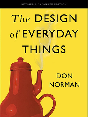
I later realized the joke was on us. Apparently there was a gaping hole in my knowledge regarding design techniques for optimizing the end user experience. Enter: “The Design of Everyday Things” by Don Norman, a book specifically written on this topic. What follows is a summary of what I found most interesting.

This book is written as an informal reference for product designers. The main idea is to consider the importance of how to best satisfy the needs of the people who will ultimately use a product.
Product design involves an incredible mix of disciplines and as designers we make decisions that balance multiple conflicting product requirements. We have to please customers who are not always the end users and sometimes we end up with a product that is great on paper but sucks to actually use. (My old Ford Fiesta immediately comes to mind…don’t get me started!)
This happens when things that end users care most about on a day to day basis are not prioritized in the design phase. Of course, all aspects of a product’s design have importance such as capabilities, reliability, financial viability, manufacturability, serviceability, maintenance schedule, appearance, etc. (Clearly, it is difficult to create good designs, which is why it is such an engaging & rewarding profession!)
The most important message in this book are the tips on how to design such that the above needs are met while also considering the factors that affect end user experience.
The Paradox of Technology:
The same technology that makes life easier by including more functions in each device, also makes life more complicated by making the device harder to learn & use!
Side note, this observation jives well with what I call ‘The Multi-Tool Rule’. That is, the more things a device can do, the less well it does each thing. Each new feature you add to a design creates some compromise to all other existing features. For instance, I would much rather use a simple digital camera than the one integrated into my phone.

Complexity Breeds Learned Helplessness:
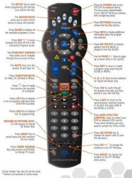
The added complexity of devices can frustrate end users. When people have problems using technology, they often blame themselves, feel stupid/guilty, and are discouraged from trying again. Modern TV Controllers & old people are kind of a trope example. But what those old folks should do is blame the designer whose responsibility it is to avoid the curse of knowledge and to accommodate the end user. (I never use half the controller buttons anyway!!)
Design tips to prevent learned helplessness:
- If user testing indicates that people fail to use your product properly, blaming the person rather than the root cause does not fix the problem. Take their difficulties as signals of where a product can be improved. (Engineers are especially guilty of this.)
- When possible, design systems to directly provide help & guidance rather than incomprehensible error codes, which only serve technicians but further frustrate the end user.
- Provide a quick undo mechanism to prevent frustration from wasting time. Ex: “I accidentally typed the wrong key in a long sequence and now I have to restart the whole procedure.” Why restart when an undo-input function would suffice?
- Provide a fool-proof out such as a state-restore button to prevent the user from creating a situation that they cannot resolve themselves. Ex: “The TV worked until I did something and now I can’t fix it.” (A state-restore would enable the user to resolve.)
- Do not design systems so that a single improper input can cause calamity. People make mistakes!
On Preventing User Error:
Forget the term “human error”! What we call human error is often a bad communication or interaction between human & machine that can usually be prevented with better human centered design. Don’t stop investigating a failure when a human cause is identified, instead use the 5 whys technique to find the root design failure.
In my opinion the author digs far too deeply into the topic of how to specifically classify errors into slips vs mistakes and he lost my interest in the details. The usable takeaway is to remember that machines are not people, and people are not machines.
That is, constructive collaboration requires both parties to make some effort to accommodate the other. Too often, designers make decisions that require humans to adapt themselves to the arbitrary & inhuman needs of the machine. Remember that precise, accurate, and timely input of information is something that humans are particularly bad at!
Design Tips for Preventing Errors:
- Ensure that displays for different purposes are significantly different from one another, or at least adequately labeled as such, so as to avoid confusion from a misinterpreted machine-state.
- Whenever possible, input sequences should be designed to differ from the very start.
- When a device has different modes in which the same controls have different meanings, be sure to make it clear which mode or state the device is in.
- When possible, minimize the number of steps required to complete an action and provide vivid reminders of remaining steps that need to be completed.
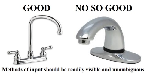
- If you want the user to interact with your device in a specific way provide appropriate visual indications. If you want them to push something then make it look as if it should be pushed!
- The most effective way of helping people to remember something is to make it unnecessary.
.
Why do people do what they do? The Seven Stages of Action:
When people use a tool of any kind they subconsciously follow a quick procedure. First they figure out what they want to do, then figure out how the tool operates. Then they use the tool and finally they figure out if the action has yielded the desired outcome.
The author put together a flow chart to illustrate this process which is a useful aid for understanding human actions & for guiding design decisions to prevent them from going awry.

Using the above chart the author derived what he calls The Seven Fundamental Principles of Design:
1. Discoverability: It should be possible to determine what actions are possible and the current state of a device just by looking. Problems arise when we cannot see how to use a device.
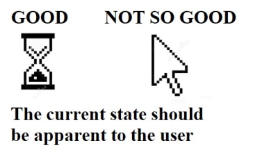
2. Feedback: There should be complete, continuous, and up to date information about the results of user actions and the current state of the device. Having your device beep to register your input, or your mouse cursor change into an hourglass to indicate loading are good methods to indicate that your click has been received and the computer is working away. (although too many beeps can quickly turn into an annoyance so use appropriately)
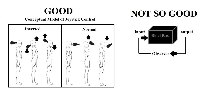
3. Conceptual model: The design should include all the information needed for the user to have a functional mental model and adequately understand the device.
4. Affordances: Features should enable desired actions to be done by the proper means. The perceived and actual properties of an object should give a clue as to its operation.

Note that a design can have accidental affordances that can cause undesired results. A hilarious example is the tool carts used at my last job which had horizontal hinged lids. The lid had to be opened to access the tools but people kept putting random things on top trapping other peoples tools inside!

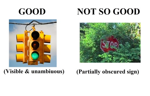
5. Signifiers: There should be appropriate signals that an action can happen and is possible. (Note: This definition is easily confused as features can be both an affordance and a signifier, such as a coffee pot handle. A good example is a concise and visible sign, label, or traffic light which shows only what is possible, though it does not physically allow or prevent an interaction.)
An important note about signs: Human cognition attempts to make sense of the world, but emotion assigns value. The addition of the hand symbol below has a greater impact than words alone.

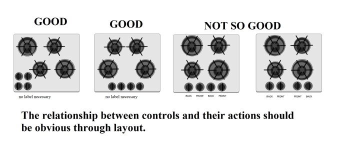
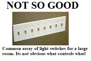
6. Mappings: The relationship between controls and their effects can be enhanced through their spatial layout. When possible place controls directly on the item to be controlled, or at least as close as possible. If that is not possible try to arrange the controls in the same spatial configuration as the objects to be controlled.
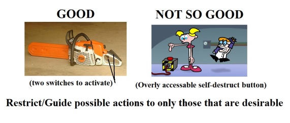
7. Constraints: Restrict the kinds of actions that can take place to only those that would produce a desirable outcome. Use physical, logical, semantic, and cultural constraints to guide actions and ease interpretation.
(Bonus Principle) Consistency: When possible, reuse existing design elements/symbols/screen layouts to make existing knowledge transferable so that new new things are easier to use. A great example is “skeuomorphic design” such as using the disc icon to indicate a save button, or a paper folder icon to indicate a structured storage system. The choice of sybol helped early computer users develop an appropriate conceptual model.
.
So should you read “The Design of Everyday Things”? Yep. Should you buy it? Meh, maybe use the library. This book is definitely full of insightful advice written by a thoughtful & seasoned designer, though it seems he forgot to apply his own methodology in the act of writing this book. It is clearly a great resource but it also felt a bit dull & tedious to parse out at times, even for me. 😊

Awesome article. Super clear, great examples.
LikeLiked by 1 person
[…] get carried away with special feature additions. Each new feature you add to a design creates some compromise to all other existing features, if at the least in the form of added complexity. Good design appears simple because it effectively […]
LikeLike